A new look. The same universe.
The updated Pockets Universe wordmark brings the orbit into focus.
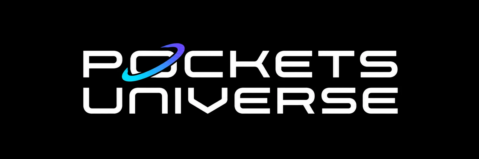
The updated Pockets Universe identity, created on October 6, keeps the two-line futuristic wordmark and gives it stronger white lettering and a crisp cyan-to-violet orbit around the O.
It is the shared signature for the universe. Individual stories retain their own titles and artwork, with Pockets Universe connecting them as part of a wider setting.
One identity across different stories
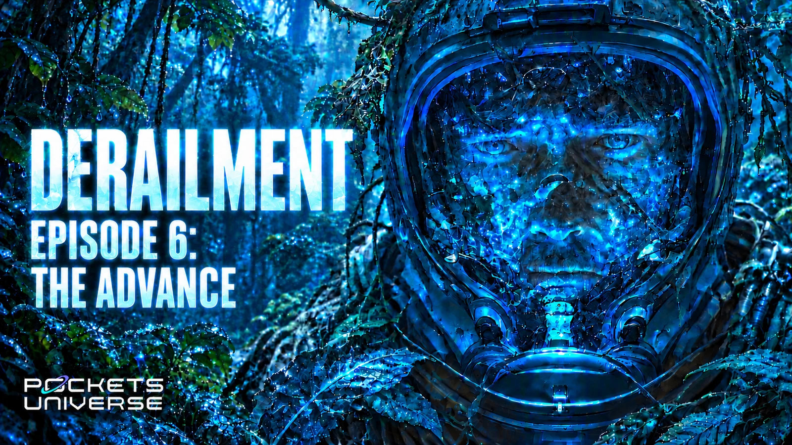
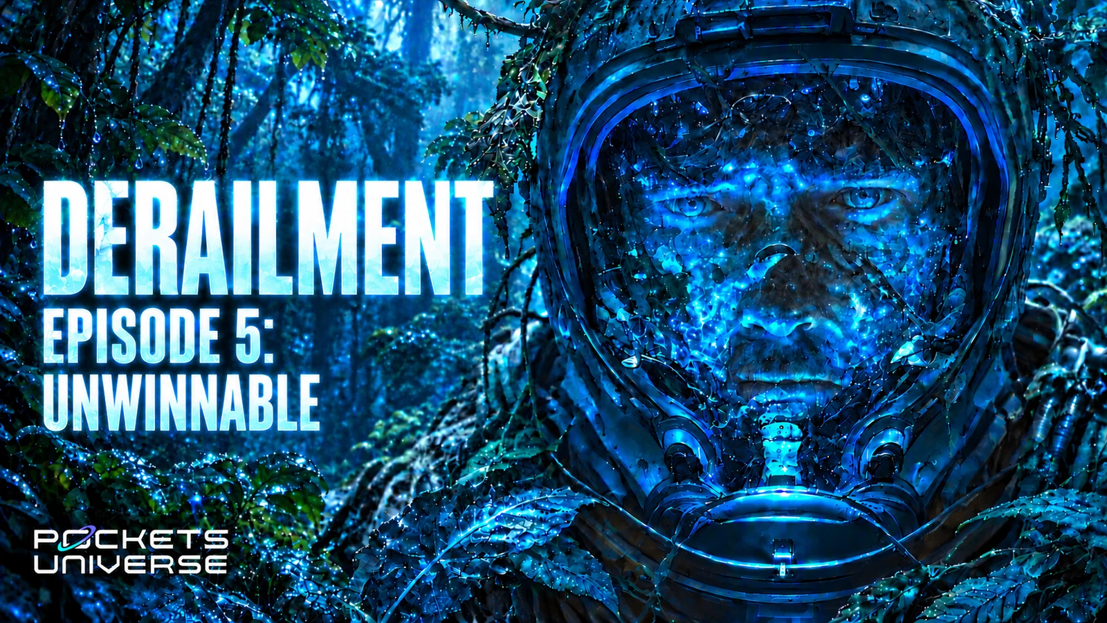
The current Derailment book, podcast, and video cover artwork carries the updated logo. The story title leads; the universe mark supplies the connection.
The cover artwork has its own atmosphere: deep blues, selective cyan light, layered environments, and human vulnerability. Together, the identity and illustrations give Pockets Universe a recognizable visual language while leaving space for different places and stories.
Discover Derailment or explore the setting.